The Children’s Society is a UK charity fighting against child poverty. It recently undertook its first rebranding exercise in over 16-years. To my amazement, I had the chance to work on this project, concepting and creating digital brand work during my time at Manifesto Digital.
Develop and implement a new design for the Children’s Society website that embodies their new brand identity and helps the Children’s Society fight for change and support disadvantaged children to have better lives.
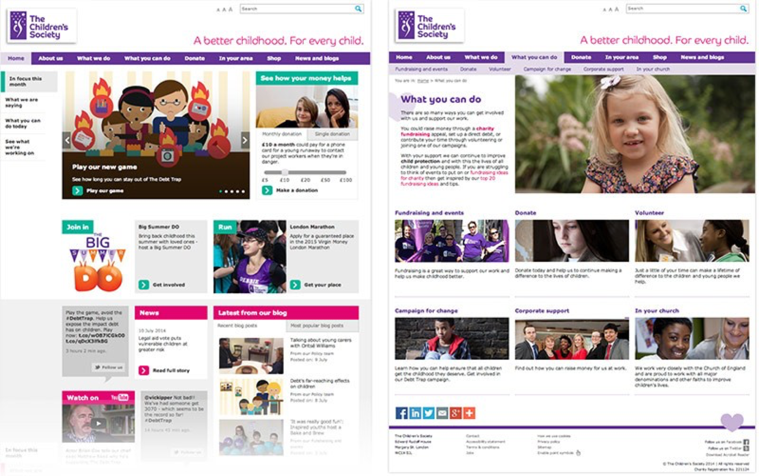
The Children’s Society website - before
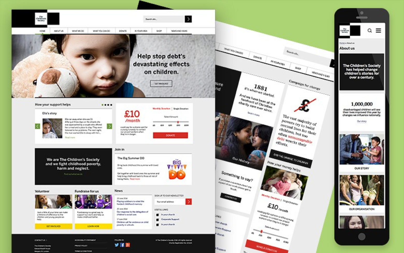
The Children’s Society website - after
After an energising kick-off meeting, we conducted a phase of research that allowed us to learn more about the Children’s Society’s target audience. From there, we started redefining user journeys, experimenting with different possible layouts and concepting creative routes.
With new print guidelines in hand, I had to digitally represent a two-word mantra for the brand, and finalise what it hoped to achieve online:

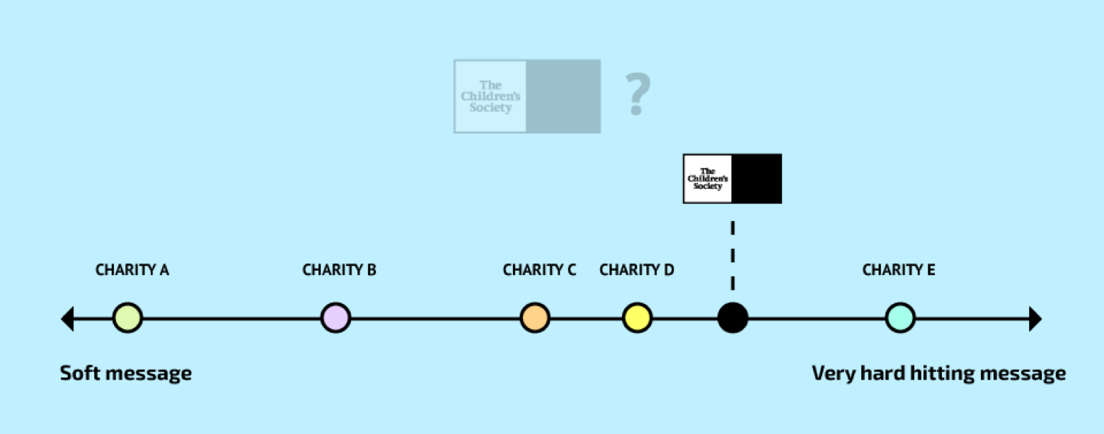
This is a drastic change compared to the guidelines that the charity was using originally. But to fully understand how hard-hitting they wanted to be with their new brand identity, we asked them to position themselves on a scale, on which we compared The Children’s Society to similar organisations and their individual brand messages.
I built a moodboard of different design elements in order to understand what type of website they were going for. We stuck all the different examples on the wall of our meeting room and literally asked the client to point at what they liked/disliked.
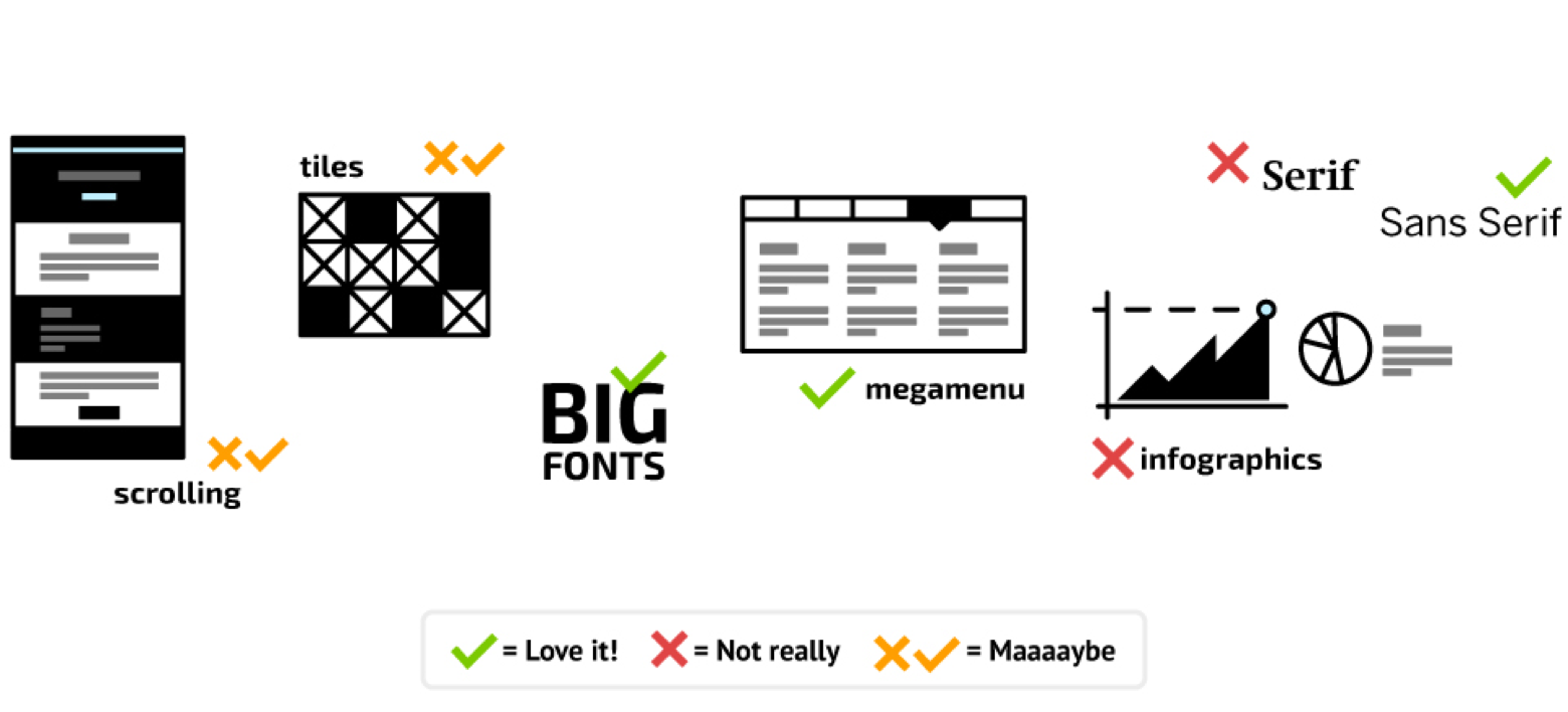
We agreed that the website would need large, high quality images, bold statements, facts and figures; white on black, in fitting with the hard truths mantra I outlined in the immersion and discovery stage. We wanted to create an engaging experience for the users, but decided to stay away from the long-scrolling structure of some websites nowadays. A megamenu as navigation was our solution to show the complex architecture of the website, which we also helped simplify in the early stages.
Once I got a good feeling for the best creative route, I started sketching and wireframing some of the different possible user journeys, which we quickly prototyped and tested.
These were the final layouts:
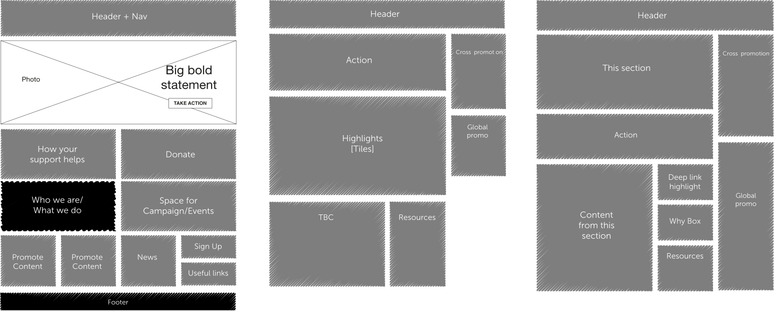

Study on tiles and call to actions
This is how all our initial studies translated into the final design of the pages:
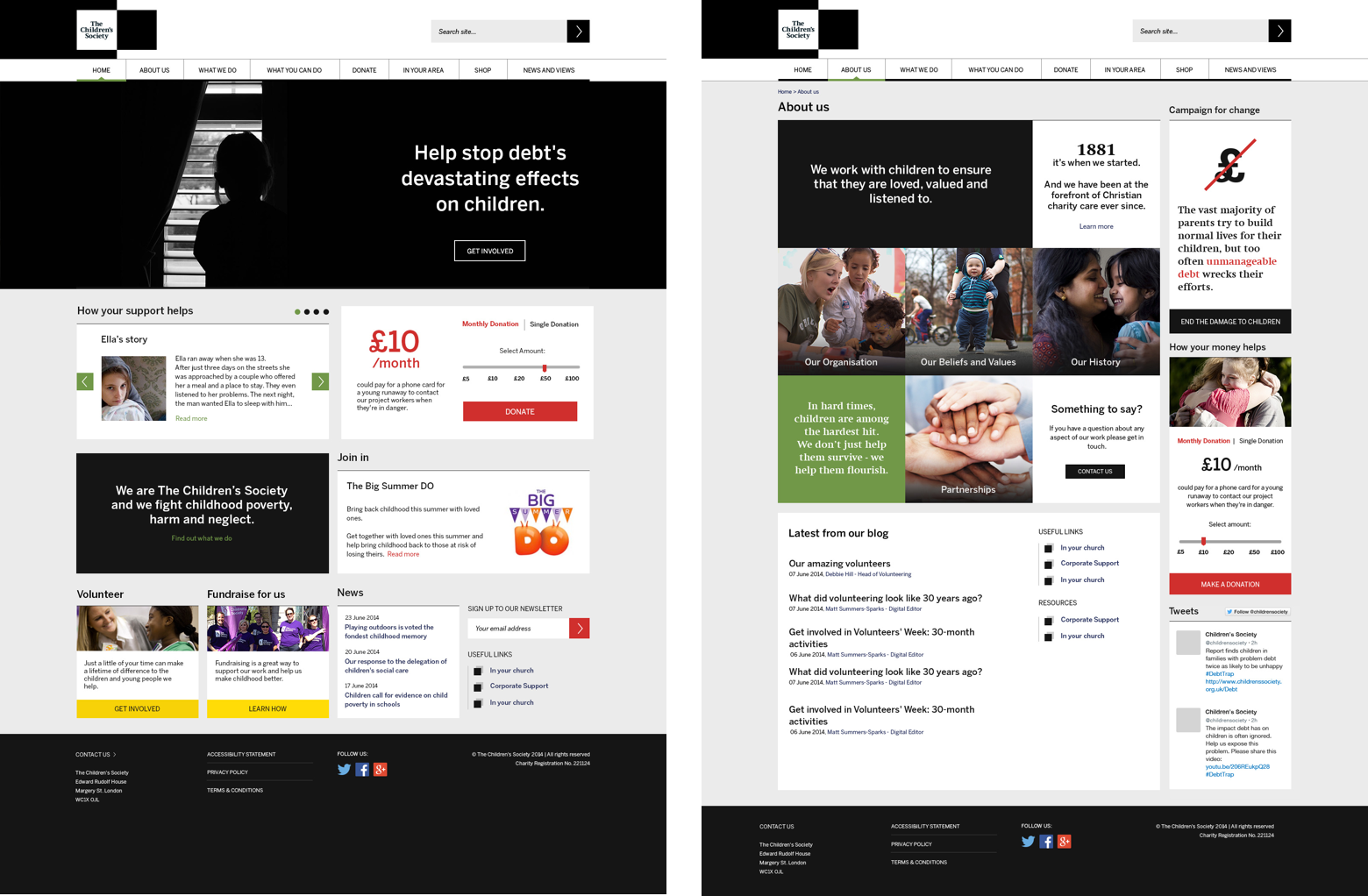
Homepage and landing page design
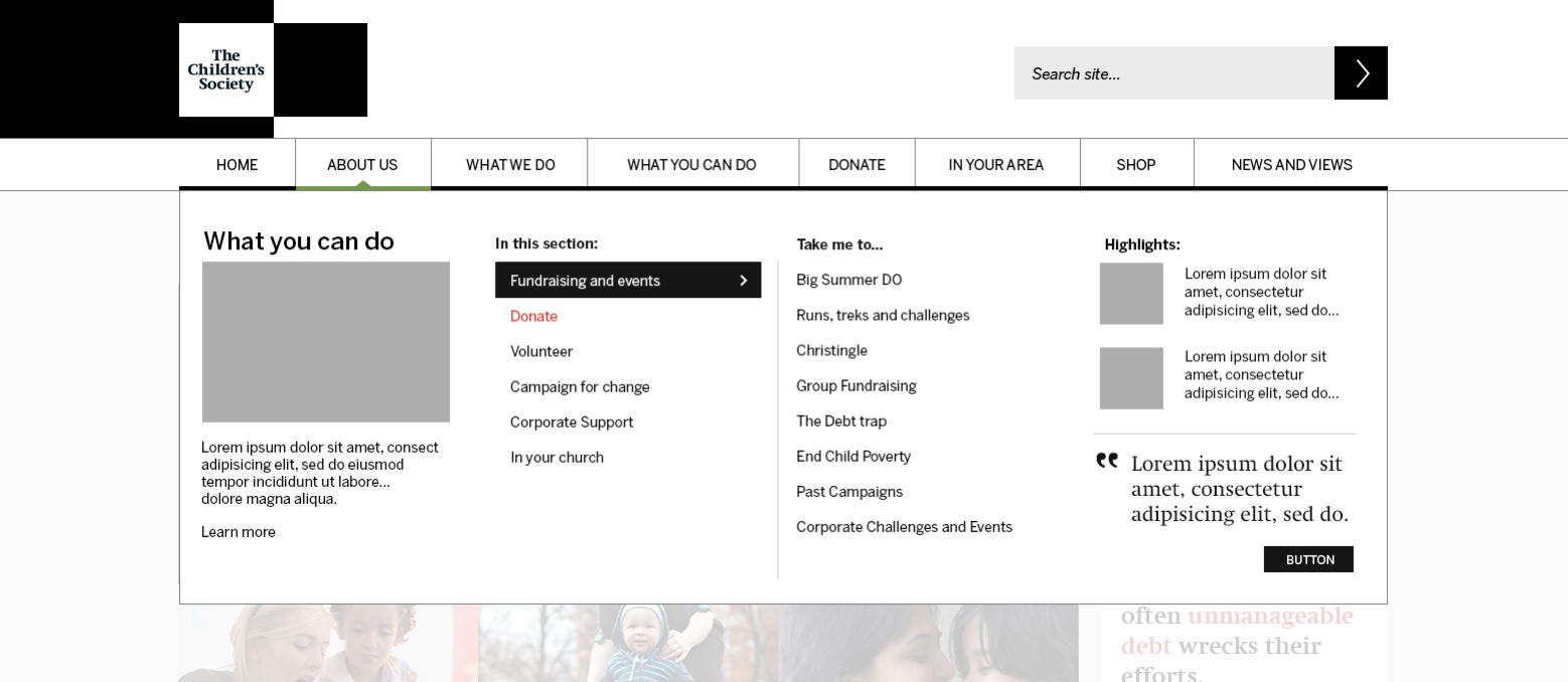
Megamenu
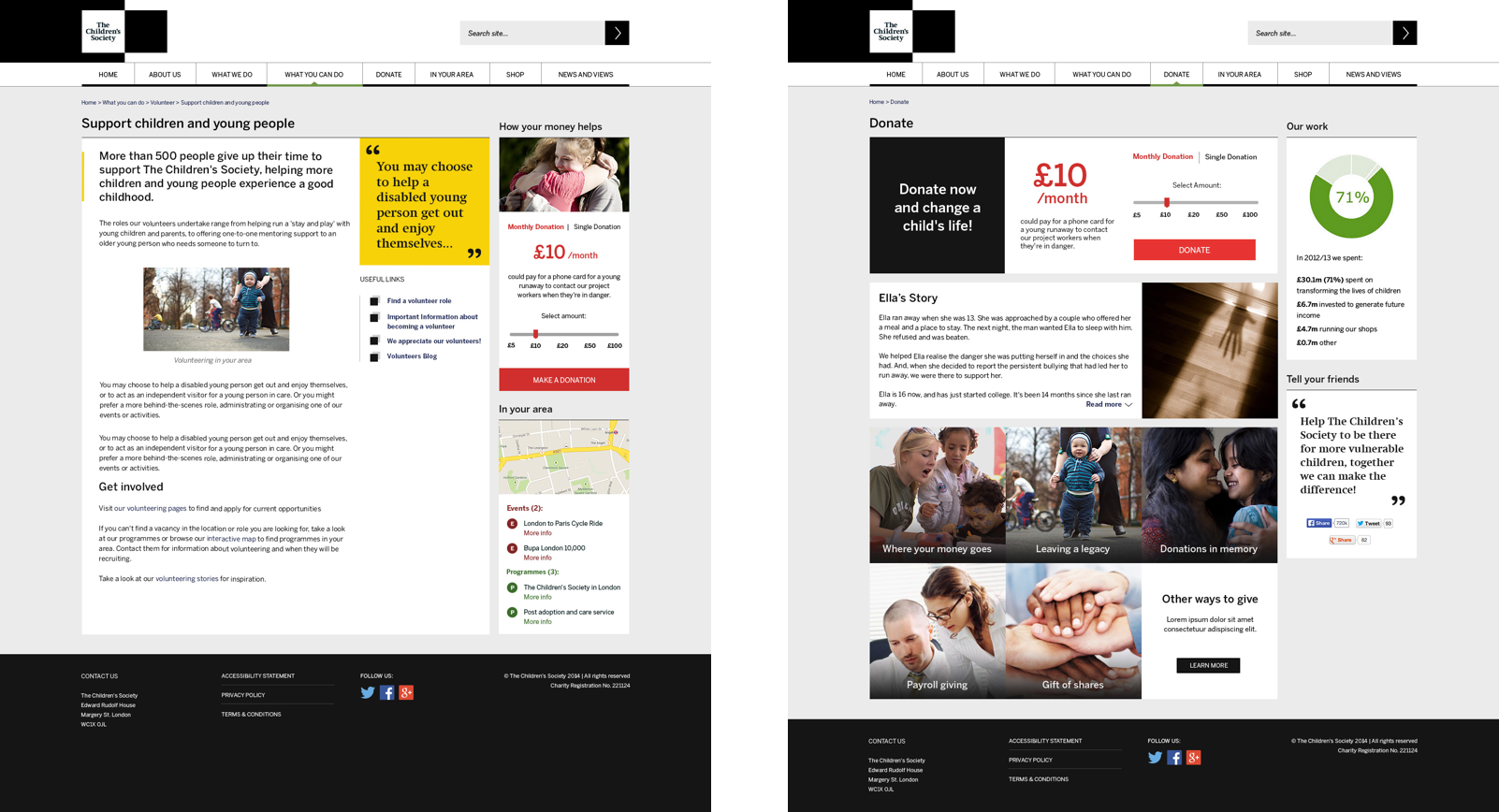
Content page and Donate page